Bar Graphs | Statistics & Probability | Maths | FuseSchool

  • Видео
  • О видео
  • Скачать
  • Поделиться

Bar Graphs | Statistics & Probability | Maths | FuseSchool

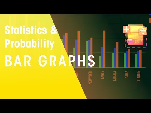
CREDITS Animation & Design: Waldi Apollis Narration: Lucy Billings Script: Lucy Billings Hi I’m Lucy and in this video, we’re going to look at bar graphs. Data can be completely overwhelming. I want to investigate how population has changed in these cities…but these numbers are just numbers. They don’t mean anything to me. In this video, we are going to discover how great bar graphs are for providing us with a clear visual, which is easy to read and interpret. Looking at this bar graph. We can now easily compare the populations of these cities in 2016… it clearly shows us that London is about one quarter the size of Tokyo. Or we could even have all 3 years on one bar graph, and compare the changes... We can easily see that some cities only have a small population change... Whereas other cities like Shanghai have a much larger change. Bar graphs are used to compare the amounts or frequencies of different things. So, for comparing different populations… Or frequencies... The taller the bar, the higher the frequency. Heart disease and cancer clearly cause many more deaths than everything else does. A bar graph should always have a title that makes it clear what is being shown. And labels on the axis. Most important are the bars. And there is a gap between each bar… most bar graphs have this gap because the data is discrete - you are either in one group or in another group. There are some special bar graphs where the bars do touch, called histograms, which we will look at in another video. There we have bar graphs. They are useful for comparing sets of data between different groups at a quick glance. The longer the bar, the greater its value. And they can run vertically or horizontally. Either one. Watch our video on pie charts to see an alternative method for displaying and comparing data. SUBSCRIBE to the FuseSchool YouTube channel for many more educational videos. Our teachers and animators come together to make fun & easy-to-understand videos in Chemistry, Biology, Physics, Maths & ICT. VISIT us at www.fuseschool.org, where all of our videos are carefully organised into topics and specific orders, and to see what else we have on offer. Comment, like and share with other learners. You can both ask and answer questions, and teachers will get back to you. These videos can be used in a flipped classroom model or as a revision aid. Find all of our Chemistry videos here: https://www.youtube.com/watch?v=cRnpKjHpFyg&list=PLW0gavSzhMlReKGMVfUt6YuNQsO0bqSMV Find all of our Biology videos here: https://www.youtube.com/watch?v=tjkHzEVcyrE&list=PLW0gavSzhMlQYSpKryVcEr3ERup5SxHl0 Find all of our Maths videos here: https://www.youtube.com/watch?v=hJq_cdz_L00&list=PLW0gavSzhMlTyWKCgW1616v3fIywogoZQ Twitter: https://twitter.com/fuseSchool Access a deeper Learning Experience in the FuseSchool platform and app: www.fuseschool.org Follow us: http://www.youtube.com/fuseschool Friend us: http://www.facebook.com/fuseschool This Open Educational Resource is free of charge, under a Creative Commons License: Attribution-NonCommercial CC BY-NC ( View License Deed: http://creativecommons.org/licenses/by-nc/4.0/ ). You are allowed to download the video for nonprofit, educational use. If you would like to modify the video, please contact us: info@fuseschool.org
6, 479   |   5 год. назад  |   60 - 0
 

Bar Graphs | Statistics & Probability | Maths | FuseSchool

Скачайте изображение (превью) выбрав качество


320x180 480x360 640x480 1280x720

CREDITS
Animation & Design: Waldi Apollis
Narration: Lucy Billings
Script: Lucy Billings

Hi I’m Lucy and in this video, we’re going to look at bar graphs. Data can be completely overwhelming.

I want to investigate how population has changed in these cities…but these numbers are just numbers. They don’t mean anything to me. In this video, we are going to discover how great bar graphs are for providing us with a clear visual, which is easy to read and interpret. Looking at this bar graph. We can now easily compare the populations of these cities in 2016… it clearly shows us that London is about one quarter the size of Tokyo. Or we could even have all 3 years on one bar graph, and compare the changes... We can easily see that some cities only have a small population change... Whereas other cities like Shanghai have a much larger change. Bar graphs are used to compare the amounts or frequencies of different things. So, for comparing different populations… Or frequencies... The taller the bar, the higher the frequency.

Heart disease and cancer clearly cause many more deaths than everything else does. A bar graph should always have a title that makes it clear what is being shown. And labels on the axis. Most important are the bars. And there is a gap between each bar… most bar graphs have this gap because the data is discrete - you are either in one group or in another group. There are some special bar graphs where the bars
do touch, called histograms, which we will look at in another video.

There we have bar graphs. They are useful for comparing sets of data between different groups at a quick glance. The longer the bar, the greater its value. And they can run vertically or horizontally. Either one. Watch our video on pie charts to see an alternative method for displaying and comparing data.

SUBSCRIBE to the FuseSchool YouTube channel for many more educational videos. Our teachers and animators come together to make fun & easy-to-understand videos in Chemistry, Biology, Physics, Maths & ICT.

VISIT us at www.fuseschool.org, where all of our videos are carefully organised into topics and specific orders, and to see what else we have on offer. Comment, like and share with other learners. You can both ask and answer questions, and teachers will get back to you.

These videos can be used in a flipped classroom model or as a revision aid.

Find all of our Chemistry videos here:


Find all of our Biology videos here:


Find all of our Maths videos here:


Twitter:

Access a deeper Learning Experience in the FuseSchool platform and app: www.fuseschool.org
Follow us:
Friend us:

This Open Educational Resource is free of charge, under a Creative Commons License: Attribution-NonCommercial CC BY-NC ( View License Deed: ). You are allowed to download the video for nonprofit, educational use. If you would like to modify the video, please contact us: info@fuseschool.org


Bar Graphs | Statistics & Probability | Maths | FuseSchool

Чтобы скачать видео "Bar Graphs | Statistics & Probability | Maths | FuseSchool" передвинте ползунок вправо


Покажите вашим друзьям, добавьте в соцсети

Ссылка на страницу с видео:


Ссылка HTML на страницу с видео:


Код для вставки плеера:


  • Комментарии

Комментарии ФБ


Уважаемые друзья!

Источником всего видеоконтента, в том числе проигрывающегося на страницах ресурса ruslar.me, является сторонний видео ресурс, а именно общедоступный видеохостинг YouTube.com, предоставляющий открытый доступ к своему видеоконтенту (используя открытую и общедоступную технологию video API3 youtube.com)!

Проблемы с авторскими правами

Если вам принадлежат авторские права на данное видео, которое было загружено без вашего согласия на YouTube.com, перейдите на страницу этого видео сайта YouTube.com , нажмите на ссылку под проигрывателем Ещё -> "Пожаловаться" -> "Нарушение моих прав" и в выпадающем меню, выбирите, что именно нарушается и нажмите кнопку "Отправить".


Неприемлемый контент

Чтобы сообщить о неприемлемом видео, перейдите на YouTube, нажмите на ссылку под проигрывателем Ещё -> "Пожаловаться" и выберите в "Сообщить о нарушении" что именно вас не устраивает в этом видео. Подробнее о наших правилах читайте в Условиях использования.